Access Protected

This case study is password protected.
Please enter the password to continue.

Incorrect password. Please try again.

Electronic Connectivity Dashboard

Visibility into
every API heartbeat.

Designing a real-time enterprise monitoring platform that transformed how operations teams detect, diagnose, and resolve API integration failures across five client systems.

Role

Sr. Product Designer · UI/UX

Timeline

Oct 2025 – Feb 2026

Type

Enterprise Dashboard Application

Stack

Figma · React 19 · TypeScript · Tailwind

One screen.
Total clarity.

DataFlow is an enterprise-grade monitoring platform that centralizes visibility into all API transactions — inbound and outbound — across a growing ecosystem of client integrations. Before DataFlow, a failure could go undetected for hours. Now, it surfaces in seconds.


"The dashboard turns a fragmented, reactive operation into a proactive, data-driven one."
75%
Reduction in issue detection time
60%
Faster mean time to resolution
90%
Reduction in context switching
93.2%
Overall API success rate achieved

From chaos to clarity.

Operations teams managing multiple API integrations were flying blind — relying on manual log dives, tribal knowledge, and reactive firefighting to keep systems running.

❌ Before

The Pain Points

  • No real-time visibility into API health or status
  • Manual log file analysis — slow and error-prone
  • Issues only discovered after clients complained
  • Data scattered across 5–7 disconnected systems
  • Delayed client notifications — damaged trust
  • No trend analysis to predict or prevent failures
✓ After

The Solution

  • Centralized real-time dashboard for all API traffic
  • Instant transaction log search with rich metadata
  • Proactive alerting surfaces issues before impact
  • Single source of truth across all client integrations
  • Automated monitoring with intelligent alerts
  • Visual trend charts for strategic decision-making

Discovery & Research

Listening before designing.

We grounded every design decision in real operational context — running 12 stakeholder interviews, observing workflows firsthand, and benchmarking against industry-leading monitoring tools.

🎙️

Stakeholder Interviews

12 in-depth sessions with system administrators, operations managers, and support engineers to uncover real pain points.

🔍

Contextual Inquiry

Observed current monitoring workflows in their real environment — capturing where teams lost time and where errors hid.

📊

Competitive Analysis

Deep review of Datadog, New Relic, and AWS CloudWatch to extract patterns worth borrowing and gaps worth filling.

⚙️

Technical Collaboration

Partnered with the backend team to fully understand data structures, API schemas, and real-time pipeline constraints.

User Personas

Designing for real people.

Two primary personas emerged from our research — each with distinct workflows, priorities, and definitions of success.

👨‍💼

Jordan Taylor

System Administrator

10 yrs in infrastructure. Manages integrations for 3 client orgs. Hates being woken up by issues that should have been caught earlier.

Goals

  • Know immediately when something breaks
  • Drill into root cause without switching tools
  • Audit transaction history with one search
  • Track retry behavior on failed requests

Frustrations

  • Scattered logs across multiple systems
  • No visual summary — only raw data
  • Zero proactive alerting
  • Can't see inbound vs outbound separately
👩‍💻

Maya Patel

Operations Manager

Leads a team of 6. Responsible for SLA compliance across all integrations. Needs the big picture and the ability to dive deep when needed.

Goals

  • Track success rates and trends over time
  • Compare performance across client IAs
  • Spot emerging issues before SLA breach
  • Export reports for leadership reviews

Frustrations

  • No aggregate view across all APIs
  • Trend data requires manual compilation
  • Can't filter by IA or time range easily
  • No single system health indicator

Information Architecture

Structure that scales.

The navigation was designed around job tasks — not system architecture. Users find what they need by what they're trying to do, not by how the backend is organized.

DataFlow Platform
Dashboard
  • KPI Overview
  • Trend Charts
  • Error Breakdown
  • System Health
  • Transaction Log
Inbound Requests
  • Card View
  • Graph View
  • Table View
  • IA Filters
  • Date Range
Outbound Requests
  • Card View
  • Graph View
  • Table View
  • IA Filters
  • Response Time
API Logs
  • Full Transaction Log
  • Request Details
  • Sub-API Status
  • Search & Filter
  • Export
User Management
  • User Directory
  • Roles & Permissions
  • IA Assignment
  • Add / Suspend

Design System & Visual Language

Coherent by design.

Every visual decision was intentional — from the typographic hierarchy that guides the eye, to the status color system that communicates health at a glance.

Color Palette

DataFlow Orange
#E8490F · Primary / Action
Ink
#0F0D0A · Background / Text
Success Green
#1A8A4A · Status Success
Error Red
#C5372A · Status Failed
Processing Blue
#1B5EA8 · Status In Progress

Typography

Dashboard
Playfair Display · 900 · Headings
Inbound Requests
DM Sans · 600 · Subheadings
Real-time monitoring of API transactions across all integrations.
DM Sans · 300 · Body copy
TXN-NCSBN-001
JetBrains Mono · IDs & Code

Components

Add New User
Export Data

Status Pills

● Success ⚠ Failed ⏱ Processing ⚠ Timeout
KPI Card
68,585
▼ -9.4%

Final Design · Key Screens

The product, in full.

Five core screens — each purpose-built for a specific operational need, designed to feel intuitive from the first session.

01 / 05

Login & Authentication

The entry point establishes trust immediately. Clean, minimal, and brand-aligned — with both email/password and Google OAuth support to accommodate all user types.

Illustrated onboarding carousel builds product context before login
Real-time field validation reduces friction and form errors
Password visibility toggle respects user autonomy
Login Screen

02 / 05

Executive Dashboard

The command center. Four headline KPIs, two trend charts, an error breakdown, a live transaction log, and a system health panel — all visible without scrolling on standard displays.
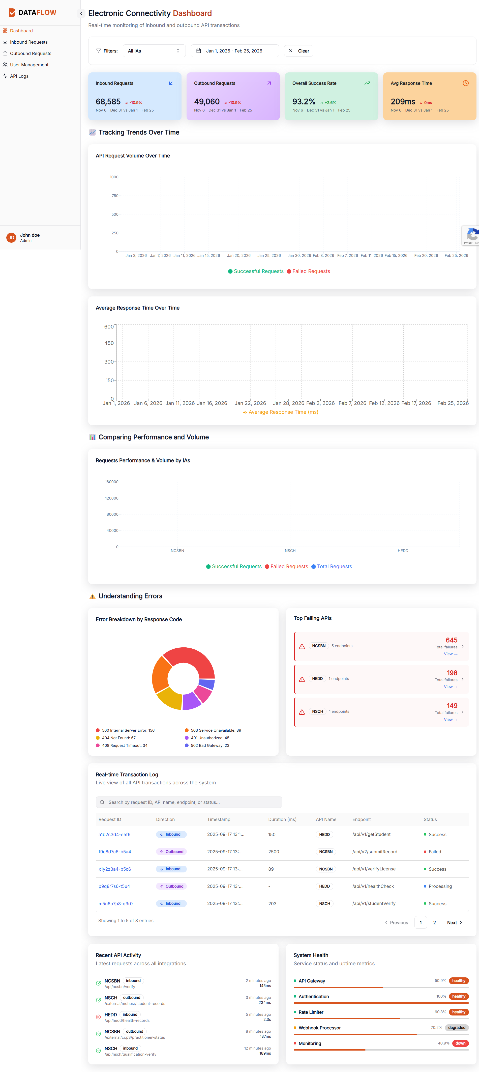
Period-over-period comparison baked into every metric
Top Failing APIs widget surfaces the most urgent issues first
System Health panel shows service uptime at a glance
Dashboard Screen

03 / 05

Inbound Request Monitoring

A focused view for tracking all API traffic entering the system. Three view modes (Card, Graph, Table) let each user type work the way they think — visual, analytical, or tabular.
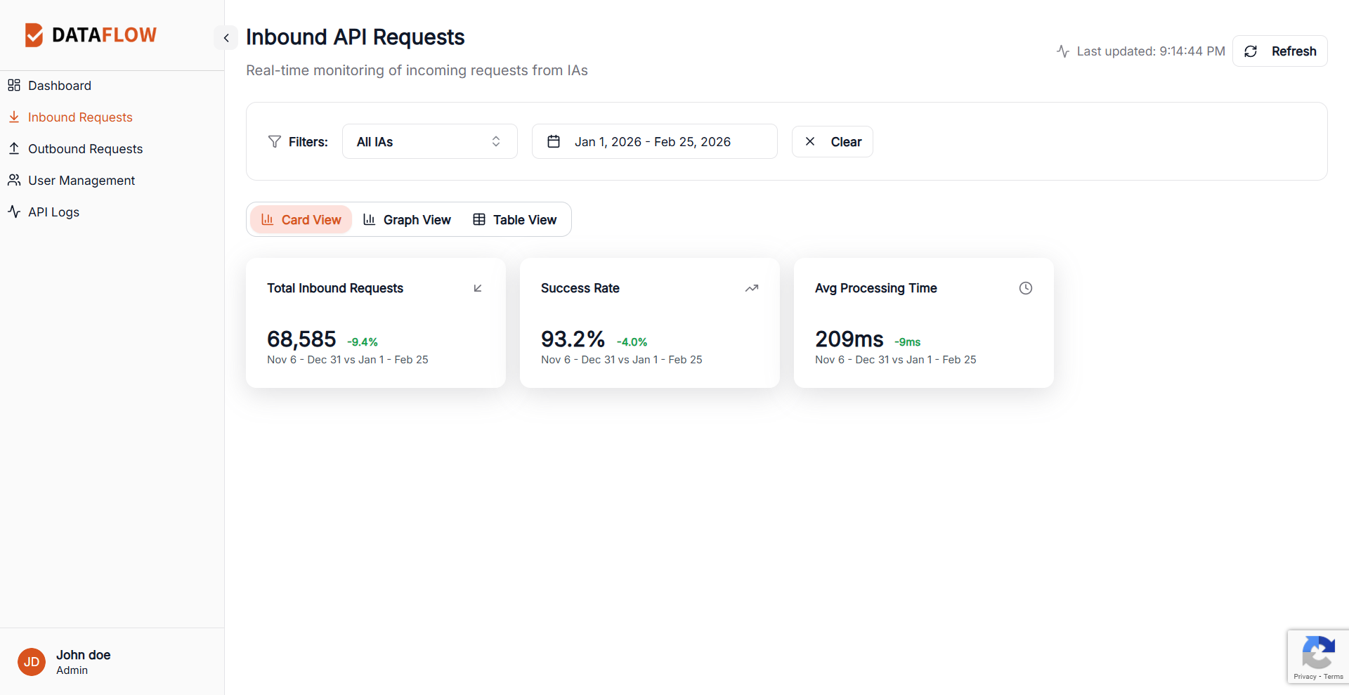
68,585 inbound requests tracked in the Jan–Feb 2026 period
IA-level filtering isolates traffic per client organization
Flexible date range picker for historical comparison
Inbound Requests Screen

04 / 05

Outbound Request Monitoring

Mirror of the inbound experience — but focused on what we're sending out. Tracks all system-initiated requests to external client APIs with the same richness of filtering and view options.
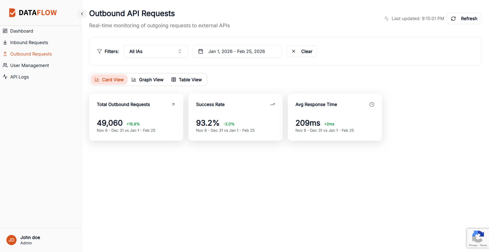
49,060 outbound requests with +15.9% growth period-over-period
Same three-mode view toggle for consistency
Avg response time surfaced as primary performance indicator
Outbound Requests Screen

05a / 05

API Transaction Logs

The deepest layer — a paginated, searchable, filterable log of every API transaction. Shows direction, timestamps, response codes, retries, and sub-API breakdowns for surgical troubleshooting.
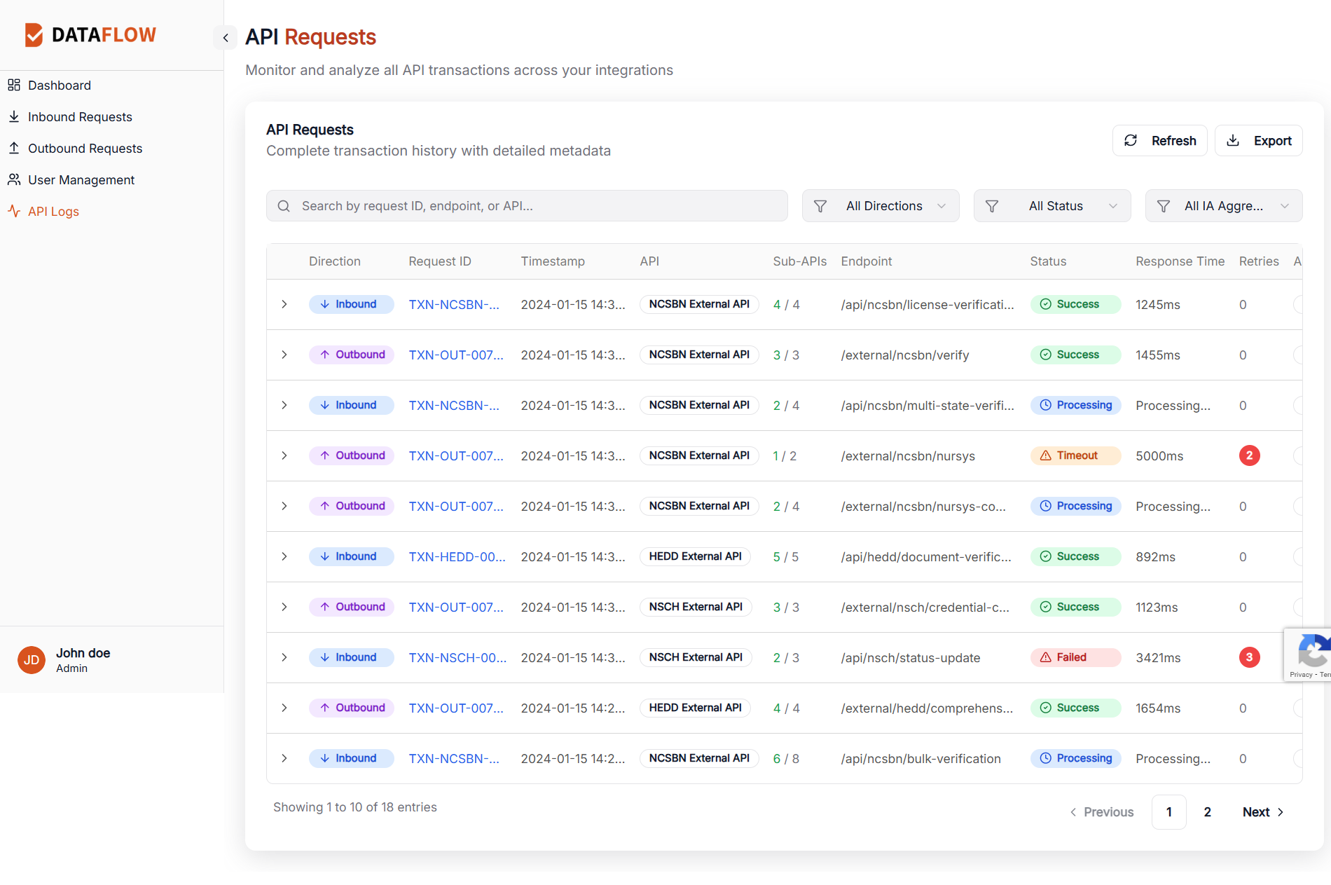
Search by Request ID, endpoint, or API name instantly
Expandable rows reveal sub-API chain and metadata
Retry count badges flag persistent failures immediately
API Logs Screen

05b / 05

User Management

A full-featured admin panel for managing access across all integrated organizations. Supports role-based permissions across Admin, Manager, Operator, and Viewer tiers.
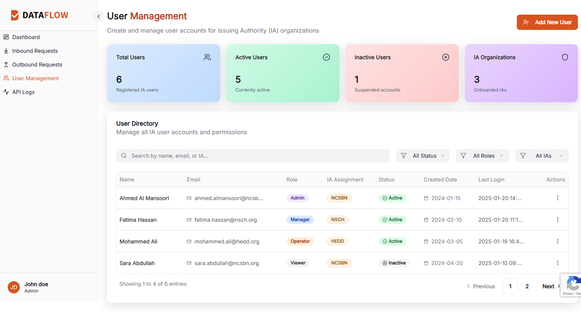
Organization-level IA assignment with color-coded badges
Last login timestamps help admins spot dormant accounts
Status filtering separates active from suspended users
User Management Screen

Projected Impact

Numbers that matter.

75%

Reduction in issue detection time — from hours to minutes

60%

Faster troubleshooting through centralized, searchable logs

90%

Less context switching — everything lives in one platform

Powerful and intuitive. Rare by design.

DataFlow achieves the balance that enterprise software rarely gets right: a platform complex enough to handle critical infrastructure monitoring, yet simple enough that a new team member can orient themselves in minutes. The result is a system that earns trust — from the first login.

Tools & Technologies

Figma
Design · Prototyping · Handoff
Design
React 19 + TypeScript
Component architecture · Type safety
Frontend
Tailwind CSS
Utility-first styling · Rapid iteration
Styling
Recharts
Data visualization · Trend charts
Charts