Access Protected

This case study is password protected.
Please enter the password to continue.

Incorrect password. Please try again.
UX Case Study · 2018 – 2020 · EMIDS × Navvis Healthcare

The Navvis
Coreo
Platform

Redesigning home healthcare coordination — bridging patients, caregivers, and service providers through a seamless digital experience across web and mobile.

Role Sr. Product Designer — UI/UX
Employer EMIDS
Client Navvis Healthcare, St. Louis MO
Period Aug 2018 – May 2020
Adobe XD
Sketch
React JS v17
HTML5 + CSS3
Bootstrap
Project Overview
EHR, reimagined
for the home.

Navvis Healthcare needed a platform that could connect ambulatory patients with home care service providers — something elegant enough for elderly patients managing daily care needs, yet powerful enough for healthcare coordinators managing dozens of cases simultaneously.

The Coreo Platform extends the Intergy EHR ecosystem into the home, supporting specialties from primary care to OBGYN, pediatrics, and beyond. Our mandate was to gather, evaluate, and translate user requirements into a cohesive design system spanning responsive web and native mobile — while also contributing to the React JS front-end implementation.

This wasn't just a design project. As a hybrid designer-developer, I worked embedded with product management and engineering from discovery through delivery, shaping both the visual language and the component architecture that would serve thousands of patients.

2
Platforms designed — responsive web dashboard & native mobile app
21mo
Embedded engagement from discovery to production
5+
User flows — dashboard, requests, providers, visits, video
1
Unified design system spanning both web and mobile surfaces

The Challenge
Three hard problems
to solve.
01
Complexity for Vulnerable Users
Patients — often elderly or managing chronic conditions — needed to schedule, track, and manage care visits without friction. Standard healthcare UX patterns were too clinical, too dense, and completely inaccessible on mobile.
02
Multi-Role Experience Design
The platform served two distinct user types: patients managing their own care and service providers managing their availability and applications. One codebase, one design system — two very different mental models to satisfy.
03
Design to Code Continuity
As a designer who also implemented in React JS, I had to ensure pixel-perfect consistency between Sketch/XD prototypes and the live application — maintaining the design system integrity as the product scaled rapidly.
Design System
Navvis Coreo
Style Guide
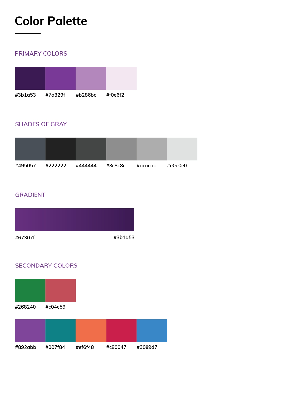
Primary
#3b1a53
#7a329f
#b286bc
#f0e6f2
Gradient
#67307f → #3b1a53
Secondary
#268240
#c04e59
#007f84
#ef6f48
#3089d7
Style Guide Cover — Navvis Coreo Home
Style Guide Cover
Color Palette — Navvis Coreo Home
Color Palette System
Product Screens
Designed for every
device, every user.
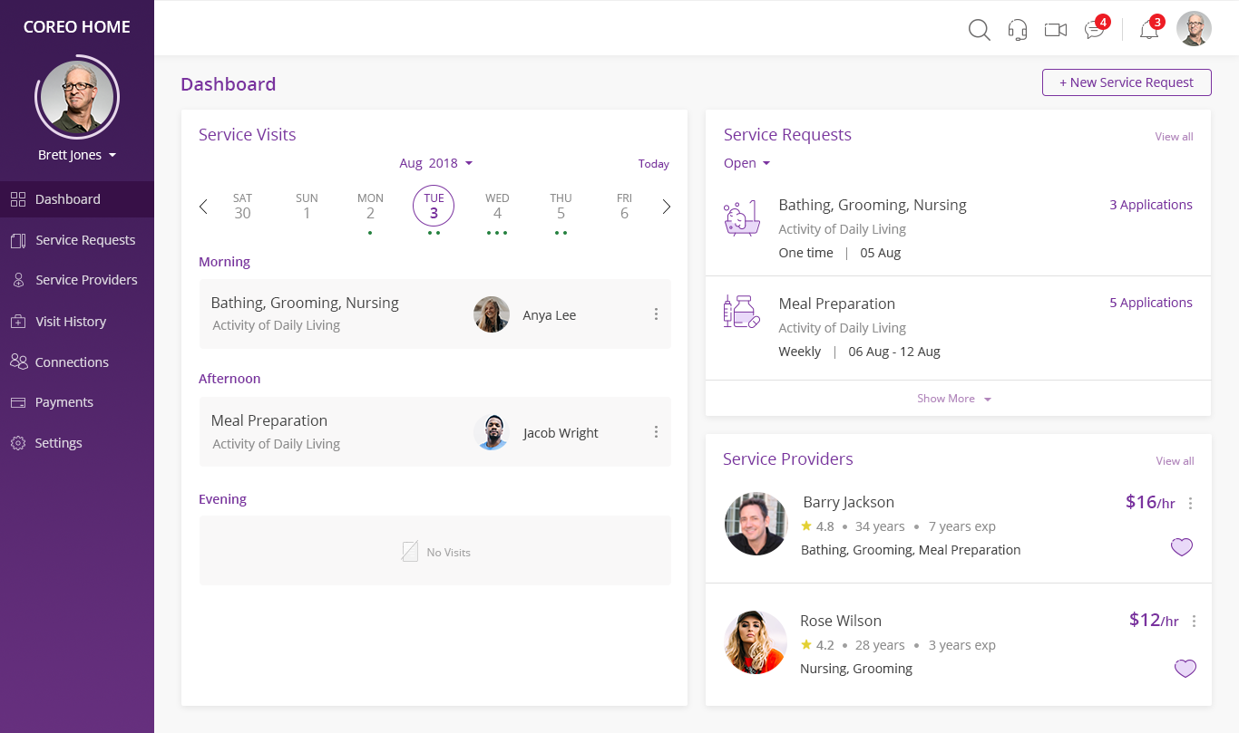
Patient Dashboard — Web
Web · Patient View

Patient Dashboard — Web

The patient's command center — a three-panel layout giving immediate visibility into upcoming service visits, open service requests, and matched care providers. The week-at-a-glance calendar with dot indicators and time-of-day grouping (Morning / Afternoon / Evening) replaced a complex scheduling module with something patients could understand at a glance. Color-coded request statuses and one-click provider access reduced cognitive load significantly.

Calendar-first layout
Real-time applications
Provider matching
Responsive 3-column grid
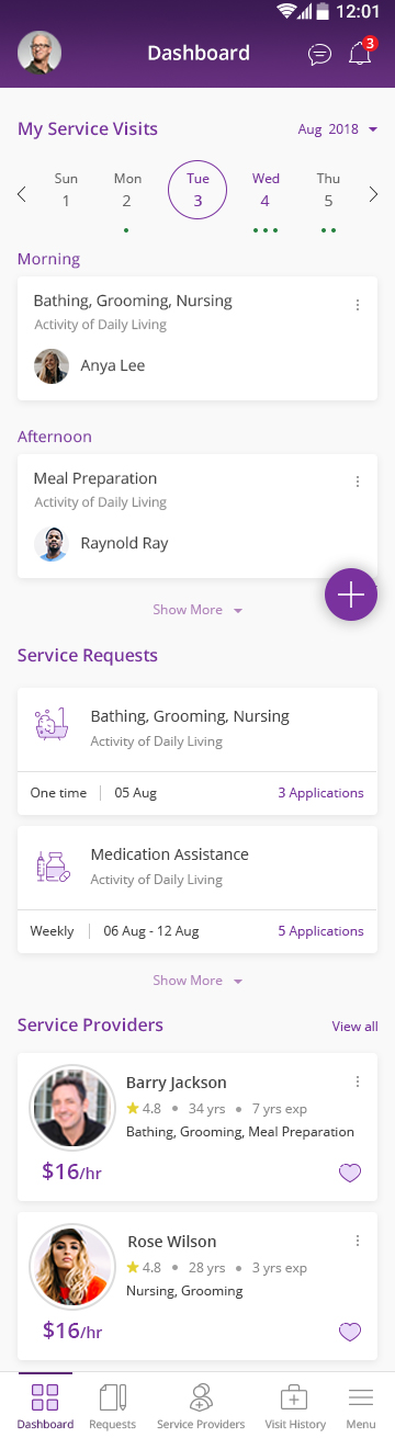
Patient Dashboard — Mobile
Mobile · Patient View

Patient Dashboard — Mobile

Every web concept had to be re-architected for the small screen — not simply stacked. On mobile, the dashboard becomes a scrollable feed, with the calendar strip anchored at the top and content revealing progressively below. The floating action button (+) surfaces the most critical action — creating a new request — without cluttering the information hierarchy. Bottom tab navigation follows natural thumb zones, keeping navigation comfortable for users who may have limited dexterity.

Thumb-zone nav
Progressive disclosure
FAB for quick actions
Accessibility-first
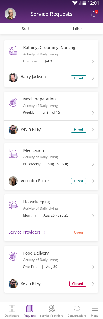
Service Requests — Mobile
Mobile · Service Requests

Service Requests — Sort & Filter

Managing multiple care requests — Bathing, Meal Prep, Medication, Housekeeping — required a list view that communicated status instantly. The design uses a compact two-level card: the service type and schedule above, the assigned provider with hiring status below. Color-coded status badges (Hired, Open, Closed) mean users never need to read fine print. Sort and Filter are promoted to equal prominence at the top, reflecting the real workflows we uncovered in user research.

Status badges
Two-level card hierarchy
Sort & filter parity
Clear date ranges
Service Providers — Web
Web · Provider Matching

Service Providers — Requests View

The service provider matching screen introduced a carousel of open requests at the top — a visual anchor that maintains context as users scroll through applicant cards below. Each provider card surfaces the essential decision-making data: rating, experience, specializations, and rate. The Hire / Invite / Applied state system gives providers clear feedback on where each relationship stands. A "90% Match" indicator — driven by service compatibility — adds algorithmic intelligence without overwhelming the UI.

Request carousel anchor
Match score algorithm
Multi-state CTA
Favoriting
Video Conference — Web
Web · Telehealth

Video Conference — Patient Web

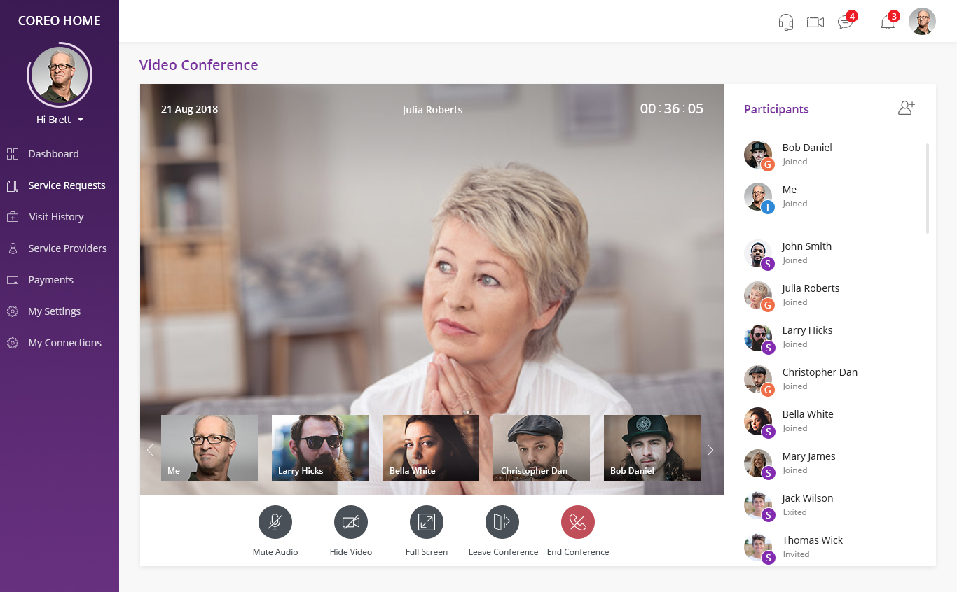
Telehealth was a critical feature expansion — connecting patients with care coordinators and family members in real time. The web experience prioritizes the active speaker in a large central frame while placing other participants in a filmstrip below, keeping all faces visible without competition. The participant panel on the right shows join status at a glance. Control icons at the bottom — Mute, Hide Video, Full Screen, Leave, End — are spaced generously for easy interaction during a call.

Active-speaker focus
Participant roster
Join/Exit status
Conference controls
Video Conference — Mobile
Mobile · Telehealth

Video Conference — Patient Mobile

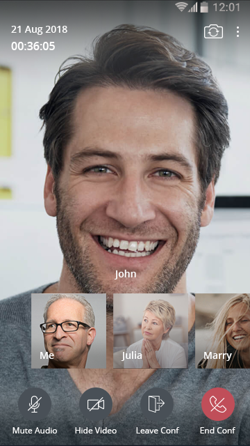
On mobile, screen real estate is precious during a video call. The active speaker fills the screen entirely — immersive, distraction-free. Participants appear in a bottom strip of small tiles. Call controls are kept to just four essential actions (Mute, Hide Video, Leave, End), with End Conference in a distinct red to ensure it's never accidentally triggered. The entire UI fades gracefully, keeping the human connection — the face on screen — as the primary focal point.

Full-bleed speaker view
Minimal control chrome
Destructive action pattern
Participant filmstrip
My Contributions
Designer, developer,
and everything between.

Wireframes, Prototypes & Storyboards

Developed end-to-end wireframes and interactive prototypes in Adobe XD and Sketch, visualizing user flows before a line of code was written. Built reusable, self-contained component modules that aligned design and engineering vocabulary.

React JS Front-End Development

Implemented production-ready UI components in React JS v17, building a maintainable and scalable codebase aligned with industry best practices — ensuring zero gap between design intent and live experience.

UX Problem Identification & Responsive Design

Applied deep UX expertise to diagnose and resolve responsiveness issues across breakpoints. Maintained the app-wide style guide as a living document, evolving it as the product scaled from MVP to full release.

Layout & Styling Implementation

Implemented layout and styling changes to existing applications using HTML5, CSS3, and Bootstrap — ensuring every interaction felt polished, coherent, and true to the design system regardless of device or browser.

Business-to-Design Translation

Served as the bridge between business requirements and technical constraints — synthesizing stakeholder input, engineering limitations, and user research into actionable, feasible design recommendations.

Secure, Standards-Compliant Front-End

Designed and implemented a front-end layer conforming to healthcare data security standards and established UI/UX industry conventions — balancing regulatory requirements with a delightful patient experience.

End-to-End Product Execution

Participated as a full-cycle team member — gathering requirements, brainstorming solutions, building final applications, and conducting testing — ensuring alignment and quality from kickoff to production launch.

Cross-Functional Collaboration

Worked directly alongside product managers and engineers in an agile environment, contributing to sprint planning and design reviews while keeping the user's perspective central to every technical and product decision.

Technology Stack
Tools of the trade.
Adobe XD
Sketch
React JS v17.0
HTML5
CSS3
Bootstrap
Component-Driven Architecture
Responsive Design
Design Systems
EHR / Healthcare UX
Agile / Scrum
Telehealth UI
Reflection
What this project meant.

The Navvis Coreo Platform proved that great healthcare UX is an act of empathy at scale — every calendar dot, every status badge, every carefully placed button represented a real patient managing their care at home. Designing across web and mobile, then building it myself in React, meant there was no gap between intention and execution. The design system I created became the single source of truth that carried the product from MVP to a platform serving thousands of patients and providers across the United States.