Redesigning document verification for the UAE's Ministry of Higher Education — turning a fragmented email-and-Drive workflow into a single, intelligent portal handling 4,000+ cases per month.
Tawkeel, a premium agency partner, managed thousands of verification cases each month with no dedicated digital infrastructure.
A purpose-built partner portal that replaces ad-hoc communication with structured, transparent, end-to-end case management.
We conducted stakeholder interviews and workflow shadowing sessions with both Tawkeel agents and DataFlow internal processors to map friction points across the verification lifecycle.
"I'm juggling 80+ applicants at a time. When a case is 'Hold', I have no idea what's missing until I email DataFlow and wait a day for a reply. By then, the applicant is calling me every hour."
"Half my day is chasing agents for the right document version. They send the wrong format, we reject it, they resend — the cycle repeats. A structured upload form would save us hours every week."
of agents reported losing track of case status at least once per week due to lack of a centralized dashboard.
of document re-submissions were caused by incorrect formats or missing fields — fixable with upfront validation.
faster case resolution was projected with real-time insufficiency notifications versus the current email workflow.
Good design is never linear. Here's how the portal evolved from whiteboard sketches to a high-fidelity, user-tested system.
We ran a 3-day workflow audit, mapping every email, shared Drive folder, and WhatsApp message involved in a single case lifecycle. The result: a 14-step process where 6 steps were entirely manual and error-prone.
We sketched three navigation models: a wizard-based flow, a tabbed dashboard, and a sidebar-driven case management layout. User testing with 4 Tawkeel agents revealed a strong preference for the dashboard model — agents wanted the "big picture" before diving into any single case.
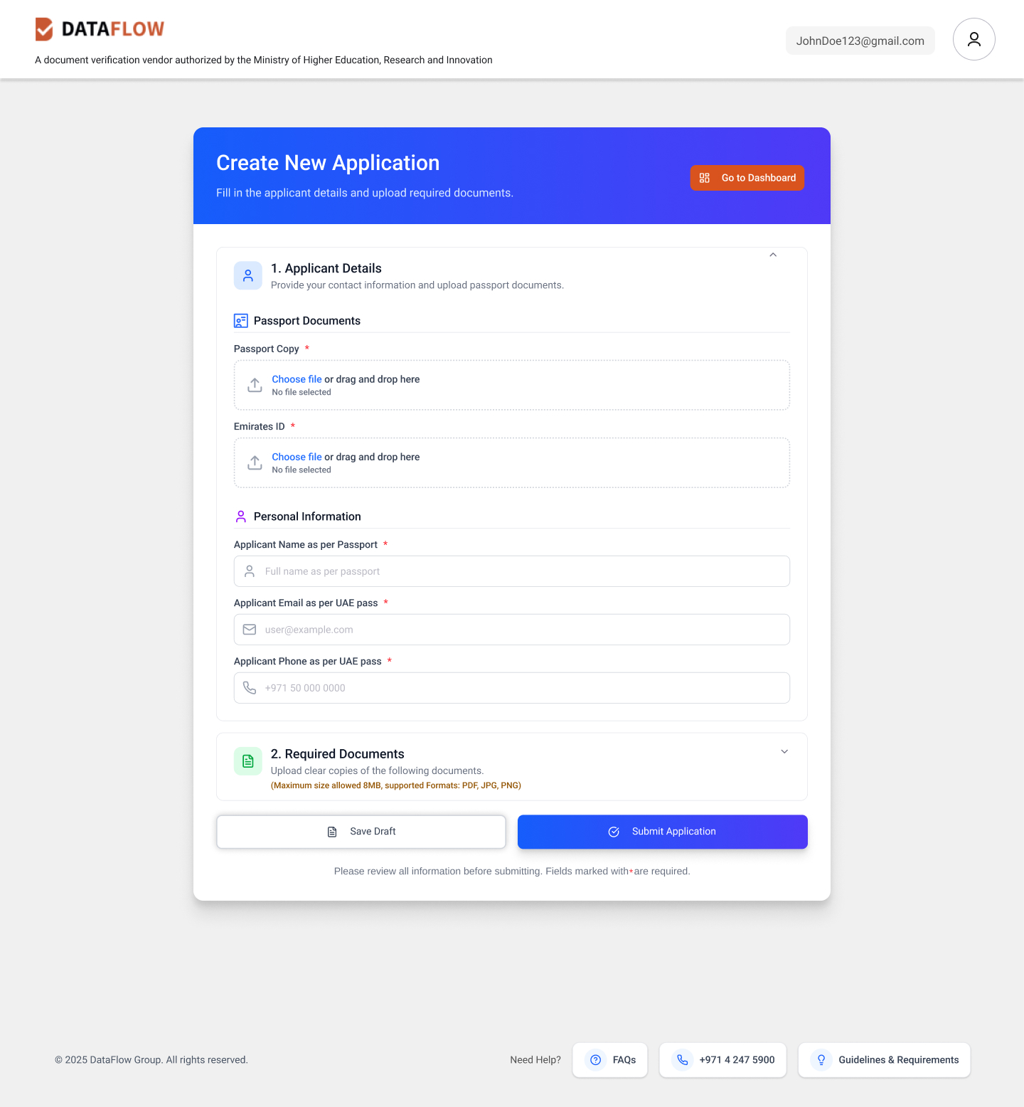
Originally the "New Case" form was a single long-scroll page. After feedback that agents lost their place mid-form, we refactored it into collapsible accordion sections (Applicant Details → Required Documents), reducing perceived complexity by 40%.
Built a cohesive token system using DataFlow's brand orange and a structured blue palette. Status badges (Screening, Hold, Result, Ready) were color-coded for instant recognition — a decision driven by agents who needed to scan 50+ rows in seconds.
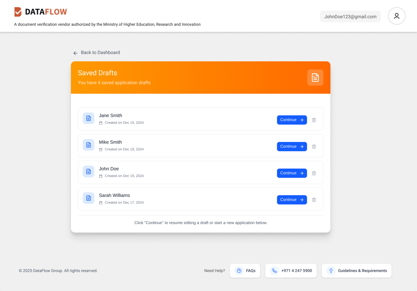
5 moderated sessions with Tawkeel agents. Key finding: the "Saved Drafts" feature was initially buried in a dropdown. We elevated it to a prominent card view with persistent "Continue →" actions — reducing draft abandonment in prototype testing by an estimated 55%.
The portal across its three core surfaces — Case Management, Application Creation, and Saved Drafts.
Agents needed the dashboard "big picture" first — not a wizard. Always test navigation models with real users before committing to an IA, no matter how logical it seems on paper.
The single-scroll form was my idea. Users destroyed it. The accordion pattern that replaced it was better in every measurable way. Feedback isn't failure — it's part of the design.
In high-stakes document workflows, users need to feel in control at every step. Color-coded status badges and real-time stage tracking aren't just UX niceties — they're trust infrastructure.